June 2006 [HOME] List of illustrations BACK
The upper graph shows an attempted reconstruction of global (Northern AND Southern) Hemisphere temperatures over nearly two millenia. The red curve that shoots up abruptly in the 20th century is based on surface and ocean instruments (confirmed by measurements of temperatures down boreholes). The rest, drawing upon countless hours of data-gathering and analysis by thousands of people, averages a variety of "proxy" data ranging from tree rings to coral reef chemical analysis. The smoothed blue curve has been attacked by critics as misleading, since there may be significant leaps and falls of temperature hidden within the yellow uncertainty band.
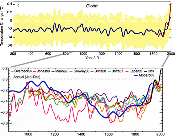
The expansion in this lower image compares a number of
different estimates over the past 1150 years, including the 1999 "hockey
stick" graph of Mann et al. (thin purple line). One recent reconstruction
(in heavy blue) using a new method showed a warm Middle Ages, although
only for the Northern Hemisphere; Mann replied with calculations indicating
the method exaggerated long-term trends. While debate continues, even
skeptics agreed with Mann and Jones's basic conclusion that "late
20th century warmth is unprecedented." The recent steep rise (black
at far right) could only be explained as a result of the parallel rise
of greenhouse gas emissions.1
Upper: Jones and Mann (2004), Rev. Geophys., 42, p. 16, doi:10.1029/2003RG000143.
Copyright © 2004 American Geophysical Union, reproduced by permission.
Lower: Science 307 (2005) p. 828, adapted from K. R. Briffa and
T. J. Osborn, Science 295 (2002), and (the recent heavy blue
line) A. Moberg et al., Nature 322 (2005).
1. Mann and Jones (2003). "We find no evidence for any earlier periods in the last two millennia with warmer conditions than the post-1990 period... [computer] model experiments that use natural-only forcings fail to reproduce this warming,"according to Moberg et al. (2005).